


Seasonal colour analysis: streamline your wardrobe and confidence
Seasonal colour analysis is a method that identifies the tones, depth, and clarity of colour that make your natural colouring look its best. The role of seasonal colour analysis in everyday style is straightforward: it tells you which colours to reach for first, which to leave on the rack, and why your wardrobe feels either effortless or exhausting depending on what’s hanging in it. Grounded in Johannes Itten’s foundational colour theory, the method has decades of practical application behind it. Research and expert commentary consistently connect dressing in flattering colours with improved confidence, mood, and even productivity — which means the payoff goes well beyond aesthetics.
Key takeaways
Seasonal colour analysis is most valuable as a practical wardrobe filter: it identifies the hue, value, and chroma that flatter your natural colouring and makes shopping, outfit building, and makeup selection faster and more consistent.
| Point | Details |
|---|---|
| Start with four seasons | Use the four-season model for a fast orientation, then refine with 12 seasons if results feel off. |
| In-person draping is most reliable | Professional draping under neutral light catches subtle overtones that photos and AI tools miss. |
| Palette is a filter, not a ban | Every season can wear most colour families; the analysis identifies the right temperature, depth, and intensity. |
| Confidence and efficiency are real outcomes | Research links flattering colour choices to improved mood, confidence, and day-to-day productivity. |
| 16thavenue seasonal collections | Browse 16thavenue’s curated seasonal pieces to shop directly within your palette. |
Table of Contents
- What is seasonal colour analysis and where did it come from?
- How does a colour analyst decide your season?
- Four-season vs. 12-season systems: which one should you use?
- What are the real benefits of seasonal colour analysis for everyday style?
- How are colour assessments actually done?
- What the research and experts actually say
- What seasonal colour analysis cannot do, and where self-tests go wrong
- Step-by-step at-home drape test you can do with a friend
- How to apply your seasonal palette to your wardrobe and makeup
- Why seasonal colour analysis is a tool, not a rulebook
- Seasonal-friendly shopping at 16thavenue
- Sources
What is seasonal colour analysis and where did it come from?
Seasonal colour analysis, also called personal colour analysis (PCA) or simply colour analysis, groups flattering colours into four seasonal families: Spring, Summer, Autumn, and Winter. The goal is to identify which family best matches your natural colouring so you can build a wardrobe that works with your complexion rather than against it.
The method’s roots go back to the early twentieth century. Bauhaus teacher Johannes Itten first observed that his students instinctively chose colours that reflected their own colouring, which led him to theorise a link between personal pigmentation and flattering hues. Suzanne Caygill later formalised a seasonal framework in the 1950s, and Carole Jackson’s 1980 book Color Me Beautiful brought the four-season system to a mass audience. Modern schools of PCA, including House of Colour, have since refined the method into detailed training programmes for certified analysts.
During a consultation, an analyst evaluates several physical features:
- Skin surface tone and undertone (warm golden/peachy vs. cool pink/blue)
- Eye colour and clarity
- Natural hair colour and depth
- Overall contrast between hair, eyes, and skin
None of these features is assessed in isolation. The analyst reads them together to determine which seasonal palette produces the most harmonious result.
How does a colour analyst decide your season?
Three technical dimensions, plus contrast, determine where you land on the seasonal spectrum.
Hue describes whether your colouring reads as warm or cool. Warm colouring has golden, peachy, or olive undertones; cool colouring leans pink, blue, or ash. A warm person looks alive in a terracotta blouse; the same blouse can make a cool-toned person look sallow.
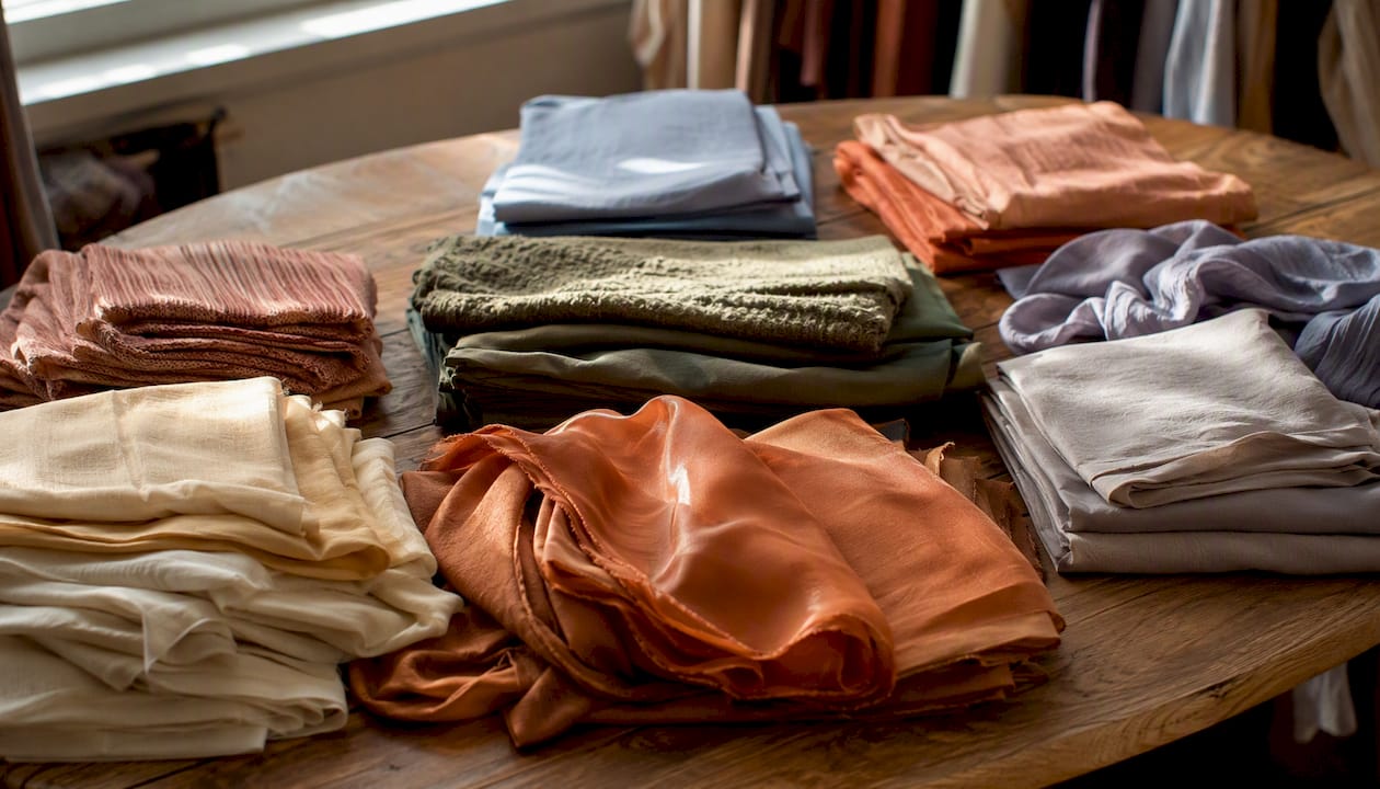
Value refers to how light or deep your overall colouring is. Someone with fair skin, light eyes, and blonde hair has high value (light); someone with deep brown skin, dark eyes, and near-black hair has low value (deep). A high-value person tends to be overpowered by very dark colours worn head to toe, while a deep-value person can carry them easily.
Chroma is the intensity or saturation of colour. Clear, bright colours suit people whose features are vivid and high-contrast. Soft, muted tones suit those whose features blend together more gently. A clear Winter can wear cobalt blue without it wearing them; a soft Summer in the same shade risks looking washed out.
Contrast ties the three dimensions together. High facial contrast (think very dark hair against very fair skin) usually points toward seasons that use stronger colour combinations. Low contrast features call for more blended, tonal palettes.
The table below shows how a single colour family shifts across the four seasons based on these dimensions, using data from ColourPaletteAnalysis:
| Colour family | Spring shade | Summer shade | Autumn shade | Winter shade |
|---|---|---|---|---|
| Blue | Aqua/turquoise | Powder blue | Teal | Cobalt/royal |
| Red | Coral red | Raspberry | Tomato/brick | True red/burgundy |
| Green | Lime/apple | Sage/mint | Olive/moss | Forest/emerald |
Pro Tip: Always assess colour under natural, indirect daylight. Incandescent bulbs add yellow; fluorescent lighting adds green. Both distort undertone readings enough to push you into the wrong season.
Four-season vs. 12-season systems: which one should you use?
The four-season model is the starting point most people recognise. Spring covers warm, light, and clear colouring. Summer is cool, light, and soft. Autumn is warm, deep, and muted. Winter is cool, deep, and clear. These four families capture the majority of people reasonably well and are easy to learn.
The 12-season system subdivides each family into three sub-seasons based on which dimension dominates. Spring, for example, splits into True Spring, Light Spring, and Bright Spring. This matters because many people sit at the edge of two families. A person who is warm but also quite muted might land in Soft Autumn rather than True Autumn, and that distinction changes which neutrals and accent colours actually flatter them. Practitioners commonly recommend the 12-season system for first-time clients precisely because it resolves these in-between cases rather than forcing a rough fit.
Start with four seasons if you want a fast, usable framework. Move to 12 seasons when you find that your assigned palette has colours that still feel off, or when you want a more precise capsule wardrobe.
What are the real benefits of seasonal colour analysis for everyday style?
The practical benefits of seasonal colour analysis extend well past knowing which lipstick to buy. Knowing your palette cuts the time you spend standing in a dressing room second-guessing a purchase. It reduces the number of items you bring home and never wear. It makes outfit combinations faster because every piece in your wardrobe already shares a colour logic.
Dressing in flattering colours is linked to measurable improvements in confidence and mood, and expert commentary connects those improvements to better interpersonal impressions and day-to-day productivity. That is not a trivial outcome for something as simple as choosing the right shade of beige.
The Axios reporting on colour analysis notes that the method can help shoppers build more cohesive wardrobes and reduce wasted purchases, though it also flags that results depend heavily on the quality of the assessment.
Practical uses for your seasonal palette include:
- Build a capsule wardrobe using your season’s neutrals as the base
- Filter online shopping by colour description (e.g., “warm ivory” vs. “cool white”)
- Choose makeup shades that complement rather than fight your undertone
- Select accessories and jewellery metals that harmonise with your skin tone
- Avoid impulse purchases in colours that consistently photograph poorly on you
How are colour assessments actually done?
In-person draping
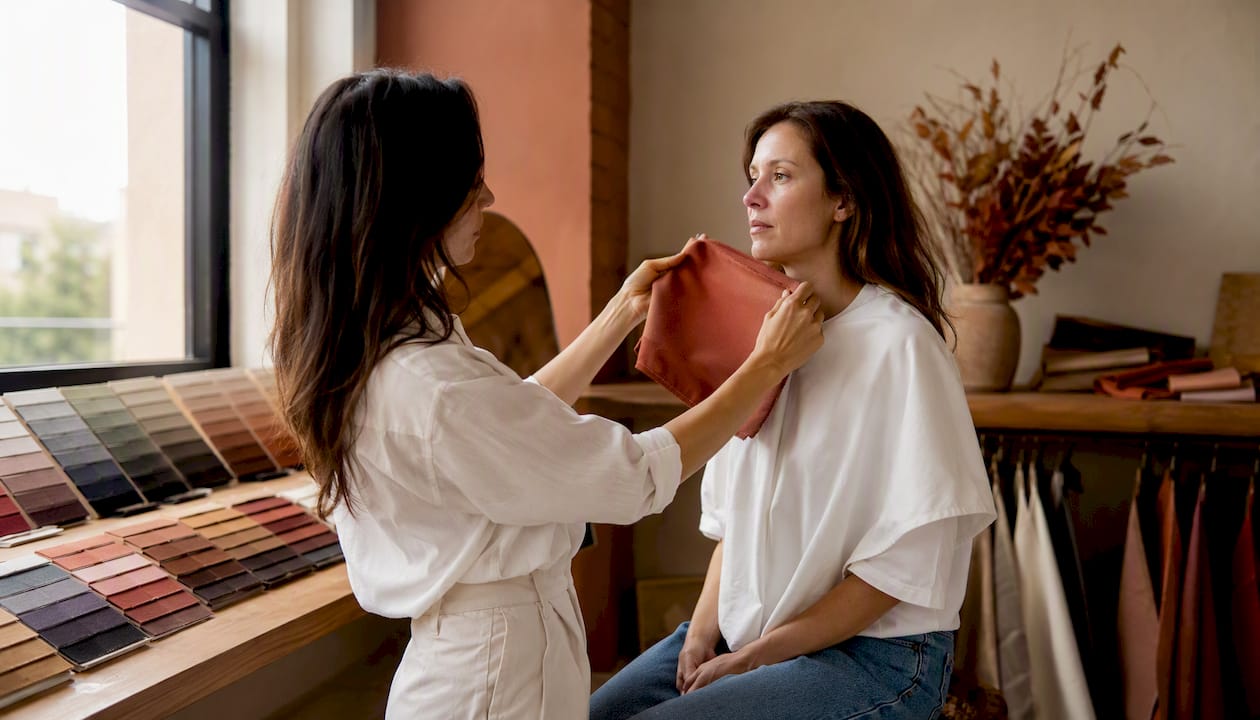
A certified analyst seats you in front of a neutral backdrop under controlled natural or daylight-balanced light, removes your makeup if possible, and drapes precision-dyed fabric swatches near your face in a specific sequence. The analyst watches how your skin responds: does it brighten and even out, or does it look shadowed and dull? House of Colour and similar schools train stylists to identify sub-seasons and “WOW” colours through this live skin-response method. It remains the most reliable approach because it accounts for subtle overtones that cameras and screens cannot capture.
Digital, AI, and photo-based tools
Online quizzes and AI photo tools are convenient and often free, but certified analysts warn that they frequently misclassify people because they cannot correct for inconsistent lighting, camera white balance, or the filters most people apply before uploading a photo. A bad self-assignment can send you down the wrong palette for months and result in purchases you will not wear.
At-home drape tests
A home test sits between the two in reliability. Done carefully, it can point you toward the right seasonal family. Done carelessly, it produces the same errors as a photo quiz.
Pros and cons at a glance:
- In-person draping: highest accuracy, accounts for subtle overtones, expensive, requires booking
- AI/photo tools: free or low-cost, instant, poor lighting correction, high misclassification risk
- At-home draping: moderate accuracy, low cost, controllable variables, requires discipline and a helper
Pro Tip: For a home test, sit facing a window with indirect natural light between 10 AM and 2 PM. Avoid direct sun, which bleaches undertones, and avoid testing in the evening under artificial light.
What the research and experts actually say
The historical lineage of seasonal colour analysis runs from Itten’s Bauhaus colour studies through Caygill’s seasonal framework and Carole Jackson’s mass-market popularisation in the 1980s, as documented in the colour analysis overview on Wikipedia. That lineage matters because it grounds the method in genuine colour theory rather than trend-driven opinion.
On the limits of modern shortcuts, the expert consensus is clear:
The practical takeaway: trust a result from a professional draping session. Treat a result from a phone quiz as a starting hypothesis worth testing, not a final answer.
What seasonal colour analysis cannot do, and where self-tests go wrong
Colour analysis is a useful tool, not a complete style system. A few common misconceptions lead to frustrating results.
Common self-test mistakes:
- Testing under bathroom or kitchen lighting, which distorts undertones
- Assessing colour while wearing hair dye or a fresh tan, both of which shift your apparent season
- Using filtered or edited photos for online quizzes
- Confusing hue (warm/cool) with chroma (bright/muted) and landing in the wrong sub-season
- Treating the palette as a ban on entire colour families rather than a guide to the right version of each colour
The method also has genuine limits. When features are subtle or low-contrast, even trained analysts can disagree. People of colour have historically been underserved by seasonal systems developed with a narrow range of skin tones in mind, and Axios notes that cultural sensitivity in palette application remains an ongoing conversation in the industry.
If your results feel ambiguous, compare the two adjacent seasons and see which palette produces a stronger skin response. When in doubt, a trained analyst is worth the investment.
Step-by-step at-home drape test you can do with a friend
A controlled home test takes about 30 minutes and gives you a useful directional result.
- Remove all makeup and put on a plain white or grey top that does not reflect colour onto your face.
- Sit facing a window with indirect natural daylight between 10 AM and 2 PM.
- Hold a warm-toned fabric (golden yellow or peach) close to your jaw and observe your skin. Ask your friend to note whether shadows appear under your eyes or your skin looks even and bright.
- Swap to a cool-toned fabric (icy pink or blue) and repeat the observation.
- Within the warmer or cooler group, test a light shade versus a deep shade to assess value.
- Finally, test a clear/bright fabric against a soft/muted one to assess chroma.
- Photograph each drape from the same angle and compare side by side.
Items to gather: four to six fabric swatches in the shades above, a neutral backdrop (white wall or sheet), a friend to observe, and a phone camera set to no filter and auto white balance.
Pro Tip: Ask your friend to watch your under-eye area and jaw specifically. Shadows and lines deepen under unflattering colours; skin looks smoother and more even under flattering ones. Selfies miss this because you are focused on the fabric, not your face.
Do not alter your hair colour or use a self-tanner before testing. Your natural colouring is what the system is designed to read.
How to apply your seasonal palette to your wardrobe and makeup
Once you have a working season, the practical application is where the method earns its keep.
Building a seasonal capsule wardrobe
Start with five foundational pieces in your season’s palette:
- A base neutral (coat, trousers, or blazer in your season’s best neutral: warm camel for Autumn, soft navy for Summer, crisp white for Winter, warm ivory for Spring)
- A statement top in one of your season’s accent colours
- A scarf or wrap that bridges your neutrals and accents
- A lipstick in your season’s most flattering tone (warm coral for Spring, berry for Winter, terracotta for Autumn, dusty rose for Summer)
- One accessory in the right jewellery metal: gold for warm seasons (Spring, Autumn), silver or white gold for cool seasons (Summer, Winter)
Shopping smarter with your palette
Carry a small fabric swatch or a saved photo of your palette on your phone. When shopping online, read colour descriptions carefully: “warm ivory” and “cool white” are not interchangeable. Check product swatches against your reference before adding to cart. This single habit cuts returns significantly.
For jewellery, warm seasons generally look best in gold and copper tones. Cool seasons tend to favour silver, platinum, and white gold. If you want guidance on how personal colour and visual storytelling affect jewellery choices, that intersection is worth exploring when building your accessory wardrobe.
Hair colour choices follow the same logic: warm seasons are flattered by golden, honey, or auburn tones; cool seasons by ash, platinum, or cool brown. Straying too far from your natural season’s temperature in your hair colour can shift how your palette reads on your skin.
Why seasonal colour analysis is a tool, not a rulebook
The method’s value is real, but it is easy to overuse it. Seasonal colour analysis works best as a decision-making filter, not a strict dress code. Knowing your season tells you where to start, not where to stop. Personal preference, occasion, cultural context, and individual expression all belong in the equation alongside your palette.
The site’s position is that colour analysis is genuinely useful for wardrobe efficiency and confidence, and that the evidence supports treating it as a practical guide rather than a rigid system. Subjectivity is built into the method, and a result that does not feel right is worth questioning rather than following blindly.
For readers who want to go deeper, 16thavenue’s seasonal trends and wardrobe curation content connects palette thinking to real shopping decisions.
Seasonal-friendly shopping at 16thavenue
Knowing your season is most useful when you can actually shop by it. 16thavenue curates seasonal collections with colour and style in mind, which makes it easier to apply your palette without hunting across dozens of sites. Autumn and Winter palettes, in particular, will find strong options in the Women’s Trendy Autumn and Winter Woolen Coat, a versatile outerwear piece in the deep, rich tones that suit those seasons best.

When browsing, compare the product’s colour swatch directly against your palette reference before purchasing. 16thavenue offers free shipping to most destinations, so testing a piece against your wardrobe at home is a low-risk way to confirm a colour works in real light. This article is published on the 16thavenue site as part of its style education series.
Browse the seasonal collections at 16thavenue to find pieces that align with your palette.
Sources
- How To Use Color Analysis To Look and Feel Your Best
- Color analysis seasons — Real Simple
- Color analysis: The benefits and limits of finding your “season”